The homepage is now often seen as the front door of the online store. Nevertheless, shoppers end up more and more directly on the product page, for example via social media or an e-mail link. This means that you have to focus even more on the product page to improve the user experience and conversion.
Now, this was already one of the hardest-working parts of the online store. This page praises the product; informs and interests the shopper, is optimized for SEO and helps customers quickly put items in their shopping cart. According to the benchmark data from Commerce Cloud (pdf), thirty percent of the sessions start on the product page, enough reason to show you your best side.
The best practices for the user experience of the product page that I share with your section in this article are thousands of website analyzes, extensive heatmap studies, benchmark data from Salesforce Commerce Cloud and industry statistics. Remember that what is a golden hold for one retailer may not catch on with someone else. Because the design of the product page is vital for your business, I recommend that you always do A / B testing before you implement changes.
Hierarchy determines the layout of your page.
The Heatmap studies show that 45 to 65 percent of shoppers do not look below the ‘purchase button.’ Keep in mind that the lower a particular item on the page, the lower the number of views. Only 11 percent of shoppers scroll down all the way to the footer.
More and more new elements are added to the product page. Think of product characteristics, price, product recommendations, extra images, videos, color samples, sizes or customer reviews. For an optimal effect for conversion, you have to determine what is most important for your customer and your brand.
Five tips for an optimal product page:
1. Optimize white space
Monitor the balance between the elements on the product page and at the same time look for possibilities to ‘cut off’ white lines, to get items higher up on the page.
2. Align horizontally
See where you can align horizontally instead of stacking elements on top of each other. Example: set the ‘quantities’ field and the ‘add to shopping cart’ button on the same line.
3. Expand menus
Use expand menus on mobile screens to show or hide content. They offer shoppers quick access to extra information without too much scrolling.
4. Place customer reviews high
Make customer reviews visible by placing them high on the page. According to data (pdf) from the sector of Econsultancy, 63 percent of shoppers say that reading a review increases the chance that they buy.
5. Put social icons at the bottom
Set icons for sharing on social at the bottom of the page. According to heat map research, the click rate is only 0.1 percent. This is more than symbolic click rate to have. This way you profit optimally from product images.
High-quality product images play a crucial role for digital shoppers. The shoppers cannot feel or try your product. Photos must show the details, characteristics, and quality. Heatmap research has revealed essential trends about how shoppers deal with varied product photos, based on where the thumbnails are and how they look. These are the results:
Thumbnail: small image, big impact
Thumbnails on the left of the primary product image have a click rate of almost 40 percent. Moreover, that while the thumbnails with the rest of the pictures, which are placed under the primary image, yield a click rate of less than eight percent.
Darts or dots to scroll?
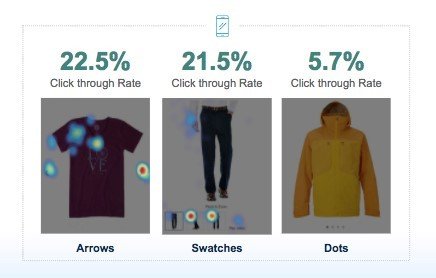
The use of left-right arrows to scroll from the first product image to the rest of the photos had the highest click rate. Thumbnails under the primary image also performed well. The dots below (which indicate swiping) were used the least, probably because they are less noticeable than arrows.

Videos: best friend of yours and your customer
Like detailed product images, videos show important product characteristics (such as how it is worn/used) that help digital shoppers decide whether to buy. If a picture says more than a thousand words, that number of videos is 10,000 or more. They show more details of the product, products in action, user instructions, and manuals. This way they win the trust of shoppers in the product in question – good for the conversion!
It is twice as likely that video viewers purchase those who do not. In fact, retailers see their sales increase by 10 percent when there are videos on the product page, and the number of returns decreases by an average of 13 percent. However, videos do not always have to be (just) about your products.
A company like Fender Guitar uses educational videos to make visitors return, persuade them to buy something, and reconnect them with brand and product.
Color samples vs. dropdowns

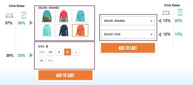
When it comes to selecting product characteristics as size and color, user-friendliness must be a plus. The process of the customer who puts his purchase in the shopping cart does not want to disturb you in any way. Looking at color samples vs. dropdowns for product selection, we see that the first has a higher click rate than the last. On both desktop and mobile. Also, the add-to-cart ratio was 11 percent for color swatches and only 5 percent for dropdowns. Why? The colors are more visible on a page, and they quickly make clear whether the product is available in the right size and color. Also, the shopper does not have to do less, so the mobile user experience is changing especially for mobile users.
Perfect that shopping cart button
‘Add to your shopping basket’ is the most important button on your website. This should stand out on your product page, to let the shoppers take action. The dimensions, color, shape, and position of your add-to-cart button must be tested so that you can determine the impact on your business. Some brands report an increase in the add-to-cart ratio of no less than 21 percent, simply by pre-testing A / B with different colors. Also consider iconography on the shopping cart, such as a plus sign or a symbol.
The shopping cart that runs with the customer
We know that shoppers are more willing to scroll mobile than on the desktop, for the simple reason that it is a natural movement on touchscreens. A sticky ‘add-to-basket’ button that stays at the bottom of the mobile screen, across the full width of the image, can be a very effective optimization. Mobile shoppers can click on ‘add-on-shopping cart’ at any time, no matter where they are on the page.
Product page more important than homepage?
The user experience on a product page has become almost more important than on the homepage. The primary goal is that a customer (as much as possible) will add products to the online shopping cart. Get started with the dates and recommendations I have just shared with you to increase your conversion. Use them as an offset point for examining your product page and see what works best for your customers and your products.


