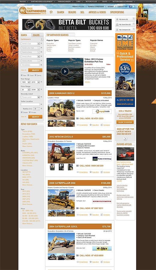
We, in the web design community, are often getting overly obsessed with design elements and piles of jQuery scripts and effects, and in the end we forget about the “good ol'” site usability. Remember those websites that were so easy to navigate and operate with? Recently when I was browsing the web, I stumbled across an earthmovers website and was surprised to a certain degree to see a website targeting audience completely outside the web masters community, not using any of today’s “trendy” elements (such as jCycle, AJAX, etc) yet being so easy to navigate and usable. And it’s so right! For example… If you searched Google for the keyword “excavators for sale“, you are probably just looking for construction equipment for sale, you don’t want to work your way through a sortable portfolio and a gazillion of CSS3 and jQuery effects that only crash your browser or behave weirdly if you are an IE user.
This is actually the perfect time for everyone to stop and look back, is YOUR website offers a smooth user experience, and if people find your website by the main search keywords, will they easily find what they were looking for, or will they end up just judging the busy design and leave your site without purchasing, completing the order form or even browsing through the actual content..?
What many of you might consider as an “outdated design” — I personally find to be “useful”. Easy flowing structure, easy navigation, images, backgrounds and videos throughout the site give the visitor an instant understanding of what the site is going to be about. Detailed and modern search structure follows you throughout the website, helping the site owners to convert visitors to potential clients and dealers. I was really happy to see that there are still web masters out there who care for site functionality more than for design trends!
If I was the visitor, searching for mechanical equipment, (as in the case above), I would be so much happier to see a clear, functioning design, where I can orientate and find what I need, without menus sliding from under my mouse and images fading upon hover.
Does your website offer a smooth user experience? Do you present your offers in a crystal clear manner? What do you think about getting back to the roots of web design, back to the times when sites were accessible in all browsers?

![The 10 Most Accurate Website Traffic Estimators [2025 Update] - Accurate Website Traffic Estimators The 10 Most Accurate Website Traffic Estimators [2025 Update] - Accurate Website Traffic Estimators](https://www.toptut.com/wp-content/uploads/2024/01/The-10-Most-Accurate-Website-Traffic-Estimators-2024-Update.jpg)


